Olivier Elemento’s weblog

Olivier’s science weblog

Billing codes and reimbursement for genomic testing – what’s the current status ? March 6, 2016

Filed under: cancer,genetics,genome,healthcare,sequencing — oelemento @ 9:56 pm

Many of us wonder how well health insurance payers cover genomic testing. The short answer is “not well” yet.

In 2014, the American Medical Association (AMA) issued new current procedural terminology (CPT) codes for genomic testing. These codes range from 81410 to 81471 (28 codes in total) and cover testing using targeted panel sequencing (5-50 genes), whole exome sequencing and whole genome sequencing (see Table 1). Codes for re-evaluation of previously obtained exome (CPT 81417) or genome (CPT 81417) sequence e.g, when updated knowledge is available or testing for unrelated condition/syndrome were even included. While the existence of such codes is a prerequisite for genomic testing reimbursement, health insurance payers do not automatically cover these tests.

Indeed the CMS fee schedule for these codes shows that only a very small fraction  – 4 out of 28 – of these genomic testing procedures are associated with an actual reimbursement. This is only data from CMS but private payers typically follow the same fee schedule.  The 4 covered procedures include targeted panel sequencing for oncology: CPT 81445 for solid tumor testing is reimbursed at $597.91 and CPT 81450 for hematological malignancies is reimbursed at $648.40.  Surprisingly, panels capable of testing for both solid and heme malignancies (CPT 81455) are not reimbursed by CMS. Two complementary germline colon cancer risk assays covering ten genes or more (CPT 81435 for sequence analysis, CPT 81436 for duplication/deletion analysis) are reimbursed at $796.75.

These multi-gene genomic testing codes complement multi-gene expression assays with algorithmic analysis (0006M to 0010M, 81490 through 81595, 16 codes). Interestingly, 5 out of these 16 codes are reimbursed (Figure 1). This includes tests provided by Cologuard (CPT code 81528, $508.87) and Oncotype DX (CPT 81519, $3,419.42).

There are many CPT codes for testing of individual genes or pairs of genes and all such tests are reimbursed (Figure 1), with reimbursement levels ranging from $58.31 (PTEN gene,  CPT 81322) to several thousand dollars. Interestingly a test simply covering Brca1&2 sequencing and full duplication/deletion analysis (CPT code 81162) is reimbursed at a whopping  $2,485.86. Presumably this is linked to the ability of test providers to provide detailed interpretation of the BRCA1&2 test’s results, which in turn enhances clinical utility. Such interpretations may be facilitated by in-house proprietary databases of genomic variants such as the one that Myriad Genetics maintains. As clinical grade annotated genetic variant information becomes more broadly publicly available (see for example ClinVar, PCT, CivicDB, our own PMKB), it is likely that the clinical utility of multi-gene genomic testing will become more obvious.


Figure 1: CMS reimbursement for single and multi-gene assays.CMSreimb

Table 1: CPT codes for multi-gene genomic assays

  CPT code  Procedure description   2016 CMS Fee ($)
  81410 Aortic dysfunction or dilation (eg, Marfan syndrome, Loeys Dietz syndrome, Ehler Danlos syndrome type IV, arterial tortuosity syndrome); genomic sequence analysis panel, must include sequencing of at least 9 genes, including FBN1, TGFBR1, TGFBR2, COL3A1, MYH11, ACTA2, SLC2A10, SMAD3, and MYLK  0
  81411 Aortic dysfunction or dilation (eg, Marfan syndrome, Loeys Dietz syndrome, Ehler Danlos syndrome type IV, arterial tortuosity syndrome); duplication/deletion analysis panel, must include analyses for TGFBR1, TGFBR2, MYH11, and COL3A1   0
 81412  Ashkenazi Jewish associated disorders (eg, Bloom syndrome, Canavan disease, cystic fibrosis, familial dysautonomia, Fanconi anemia group C, Gaucher disease, Tay-Sachs disease), genomic sequence analysis panel, must include sequencing of at least 9 genes, including ASPA, BLM, CFTR, FANCC, GBA, HEXA, IKBKAP, MCOLN1, and SMPD1  0
 81415 Exome (eg, unexplained constitutional or heritable disorder or syndrome); sequence analysis  0
 81416 Exome (eg, unexplained constitutional or heritable disorder or syndrome); sequence analysis, each comparator exome (eg, parents, siblings) (List separately in addition to code for primary procedure)  0
 81417 Exome (eg, unexplained constitutional or heritable disorder or syndrome); re-evaluation of previously obtained exome sequence (eg, updated knowledge or unrelated condition/syndrome)  0
 81420 Fetal chromosomal aneuploidy (eg, trisomy 21, monosomy X) genomic sequence analysis panel, circulating cell-free fetal DNA in maternal blood, must include analysis of chromosomes 13, 18, and 21  0
 81425 Genome (eg, unexplained constitutional or heritable disorder or syndrome); sequence analysis  0
 81426 Genome (eg, unexplained constitutional or heritable disorder or syndrome); sequence analysis, each comparator genome (eg, parents, siblings) (List separately in addition to code for primary procedure)  0
 81427 Genome (eg, unexplained constitutional or heritable disorder or syndrome); re-evaluation of previously obtained genome sequence (eg, updated knowledge or unrelated condition/syndrome)  0
 81430  Hearing loss (eg, nonsyndromic hearing loss, Usher syndrome, Pendred syndrome); genomic sequence analysis panel, must include sequencing of at least 60 genes, including CDH23, CLRN1, GJB2, GPR98, MTRNR1, MYO7A, MYO15A, PCDH15, OTOF, SLC26A4, TMC1, TMPRSS3, USH1C, USH1G, USH2A, and WFS1  0
 81431 Hearing loss (eg, nonsyndromic hearing loss, Usher syndrome, Pendred syndrome); duplication/deletion analysis panel, must include copy number analyses for STRC and DFNB1 deletions in GJB2 and GJB6 genes  0
 81432 Hereditary breast cancer-related disorders (eg, hereditary breast cancer, hereditary ovarian cancer, hereditary endometrial cancer); genomic sequence analysis panel, must include sequencing of at least 14 genes, including ATM, BRCA1, BRCA2, BRIP1, CDH1, MLH1, MSH2, MSH6, NBN, PALB2, PTEN, RAD51C, STK11, and TP53  0
 81433 Hereditary breast cancer-related disorders (eg, hereditary breast cancer, hereditary ovarian cancer, hereditary endometrial cancer); duplication/deletion analysis panel, must include analyses for BRCA1, BRCA2, MLH1, MSH2, and STK11  0
 81434 Hereditary retinal disorders (eg, retinitis pigmentosa, Leber congenital amaurosis, cone-rod dystrophy), genomic sequence analysis panel, must include sequencing of at least 15 genes, including ABCA4, CNGA1, CRB1, EYS, PDE6A, PDE6B, PRPF31, PRPH2, RDH12, RHO, RP1, RP2, RPE65, RPGR, and USH2A  0
 81435 Hereditary colon cancer disorders (eg, Lynch syndrome, PTEN hamartoma syndrome, Cowden syndrome, familial adenomatosis polyposis); genomic sequence analysis panel, must include sequencing of at least 10 genes, including APC, BMPR1A, CDH1, MLH1, MSH2, MSH6, MUTYH, PTEN, SMAD4, and STK11   796.75
 81436 Hereditary colon cancer disorders (eg, Lynch syndrome, PTEN hamartoma syndrome, Cowden syndrome, familial adenomatosis polyposis); duplication/deletion analysis panel, must include analysis of at least 5 genes, including MLH1, MSH2, EPCAM, SMAD4, and STK11   796.75
 81437  Hereditary neuroendocrine tumor disorders (eg, medullary thyroid carcinoma, parathyroid carcinoma, malignant pheochromocytoma or paraganglioma); genomic sequence analysis panel, must include sequencing of at least 6 genes, including MAX, SDHB, SDHC, SDHD, TMEM127, and VHL  0
 81438 Hereditary neuroendocrine tumor disorders (eg, medullary thyroid carcinoma, parathyroid carcinoma, malignant pheochromocytoma or paraganglioma); duplication/deletion analysis panel, must include analyses for SDHB, SDHC, SDHD, and VHL  0
 81440 Nuclear encoded mitochondrial genes (eg, neurologic or myopathic phenotypes), genomic sequence panel, must include analysis of at least 100 genes, including BCS1L, C10orf2, COQ2, COX10, DGUOK, MPV17, OPA1, PDSS2, POLG, POLG2, RRM2B, SCO1, SCO2, SLC25A4, SUCLA2, SUCLG1, TAZ, TK2, and TYMP  0
 81442 Noonan spectrum disorders (eg, Noonan syndrome, cardio-facio-cutaneous syndrome, Costello syndrome, LEOPARD syndrome, Noonan-like syndrome), genomic sequence analysis panel, must include sequencing of at least 12 genes, including BRAF, CBL, HRAS, KRAS, MAP2K1, MAP2K2, NRAS, PTPN11, RAF1, RIT1, SHOC2, and SOS1  0
 81445 Targeted genomic sequence analysis panel, solid organ neoplasm, DNA analysis, and RNA analysis when performed, 5-50 genes (eg, ALK, BRAF, CDKN2A, EGFR, ERBB2, KIT, KRAS, NRAS, MET, PDGFRA, PDGFRB, PGR, PIK3CA, PTEN, RET), interrogation for sequence variants and copy number variants or rearrangements, if performed   597.91
 81450  Targeted genomic sequence analysis panel, hematolymphoid neoplasm or disorder, DNA analysis, and RNA analysis when performed, 5-50 genes (eg, BRAF, CEBPA, DNMT3A, EZH2, FLT3, IDH1, IDH2, JAK2, KRAS, KIT, MLL, NRAS, NPM1, NOTCH1), interrogation for sequence variants, and copy number variants or rearrangements, or isoform expression or mRNA expression levels, if performed   648.40
 81455  Targeted genomic sequence analysis panel, solid organ or hematolymphoid neoplasm, DNA analysis, and RNA analysis when performed, 51 or greater genes (eg, ALK, BRAF, CDKN2A, CEBPA, DNMT3A, EGFR, ERBB2, EZH2, FLT3, IDH1, IDH2, JAK2, KIT, KRAS, MLL, NPM1, NRAS, MET, NOTCH1, PDGFRA, PDGFRB, PGR, PIK3CA, PTEN, RET), interrogation for sequence variants and copy number variants or rearrangements, if performed  0
 81460  Whole mitochondrial genome (eg, Leigh syndrome, mitochondrial encephalomyopathy, lactic acidosis, and stroke-like episodes [MELAS], myoclonic epilepsy with ragged-red fibers [MERFF], neuropathy, ataxia, and retinitis pigmentosa [NARP], Leber hereditary optic neuropathy [LHON]), genomic sequence, must include sequence analysis of entire mitochondrial genome with heteroplasmy detection  0
 81465  Whole mitochondrial genome large deletion analysis panel (eg, Kearns-Sayre syndrome, chronic progressive external ophthalmoplegia), including heteroplasmy detection, if performed  0
 81470  X-linked intellectual disability (XLID) (eg, syndromic and non-syndromic XLID); genomic sequence analysis panel, must include sequencing of at least 60 genes, including ARX, ATRX, CDKL5, FGD1, FMR1, HUWE1, IL1RAPL, KDM5C, L1CAM, MECP2, MED12, MID1, OCRL, RPS6KA3, and SLC16A2  0
 81471  X-linked intellectual disability (XLID) (eg, syndromic and non-syndromic XLID); duplication/deletion gene analysis, must include analysis of at least 60 genes, including ARX, ATRX, CDKL5, FGD1, FMR1, HUWE1, IL1RAPL, KDM5C, L1CAM, MECP2, MED12, MID1, OCRL, RPS6KA3, and SLC16A2  0


Note: CPT codes and descriptions are copyright 2016 American Medical Association. All rights reserved. CPT is a registered trademark of the American Medical Association (AMA).
 

Illuminating hospital prices in New York State January 5, 2014

Filed under: bigdata,healthcare — oelemento @ 8:37 pm

In an effort to bring much needed transparency to the health care system, New York State recently released a comprehensive dataset of hospital inpatient treatment prices. The dataset covers 229 hospitals, 1,250 treatments and is derived from 7,867,260 hospital discharges during the 2009-2011 period. As noted elsewhere, there is much hostpital-to-hospital variability in prices in our state (and anywhere else) and the reasons for this variability are hardly clear. In an attempt to shed some light on this variability, I downloaded the data, ran a few statistical analyses and sought to cross-reference hospital prices with other hospital-associated measures and a couple of socio-economic factors.

Here are the questions I sought to address:

** What are the most and least price variable inpatient treatments in New York State ?

For this analysis, I focused on the most recent reporting year (2011) and calculated the coefficient of variation for each treatment. I used the median $ amounts that hospitals charge for each treatment. The hospital charge is what the hospital asks you or your insurance to pay. If you don’t have insurance, you have to pay the full charge. If you do have insurance, your insurance company will usually pay less than the charged amount but see below for more on this topic. I calculated the average of all hospital median charges for each treatment, divided by the standard deviation and ranked treatments by the resulting value (coefficient of variation). For each procedure, I only took into account hospitals that have performed that treatment 10 or more times in 2011 so that the median provides a reliable measure of price for each hospital.

Below is the list of the 10 most price variable treatments:

Treatment (Severity) Coefvar Min median price Max median price
HIV W Major HIV Related Condition (Major) 1.68 $11,520 $488,219
HIV W One Signif HIV Cond Or W/O Signif Related Cond (Moderate) 1.61 $7,745 $228,205
Depression Except Major Depressive Disorder (Minor) 0.99 $2,268 $83,839
Childhood Behavioral Disorders (Moderate) 0.91 $3,491 $95,612
Neonate Bwt 2000-2499G, Normal Newborn Or Neonate W Other Problem (Moderate) 0.90 $1,855 $54,399
Extracranial Vascular Procedures (Moderate) 0.78 $6,688 $139,643
Childhood Behavioral Disorders (Minor) 0.77 $2,641 $57,434
Adjustment Disorders & Neuroses Except Depressive Diagnoses (Moderate) 0.76 $2,085 $38,971
Acute Anxiety & Delirium States (Minor) 0.74 $3,030 $56,774
Neonate Birthwt >2499G, Normal Newborn Or Neonate W Other Problem (Major) 0.70 $1,451 $39,170

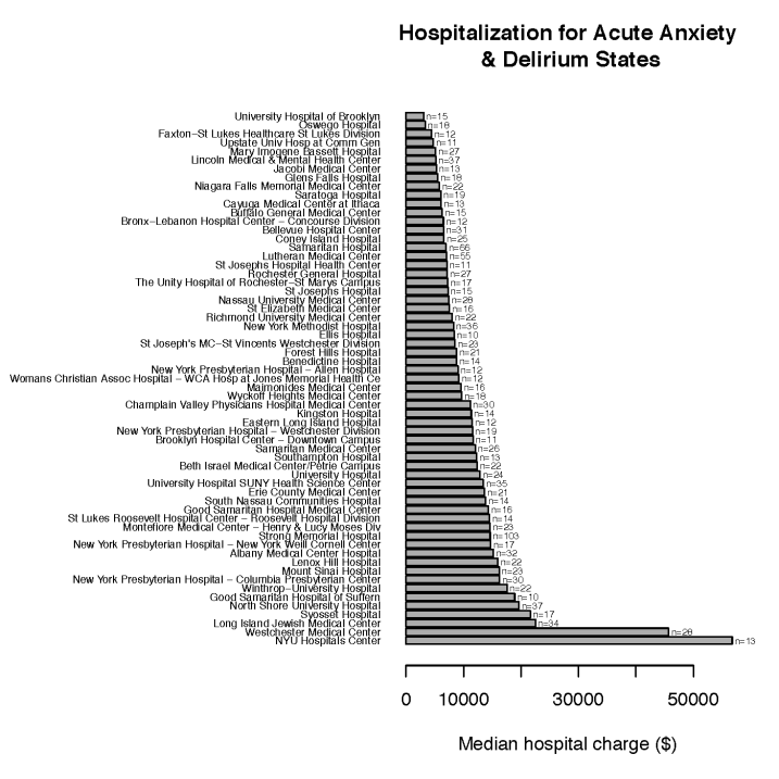
A couple of things jump out. One is that overall these highly price variable treatments are not procedures, instead they are diagnoses. There is a clear over-representation of HIV-related and mental/behavioral disorders and pregnancy-related hospitalizations. One possible explanation for the price variability is that the treatment guidelines for these conditions may not be as standardized as they are for more traditional procedures. Another potential explanation is that treatment course and/or response may be highly variable among patients, hence leading to variable  length of hospital stays or diverse medications being used. Note this, though: these are median prices and the sample sizes (number of discharges) are reasonably high (n>=10). What that means is some hospitals are systematically more expensive than others when it comes to treating these conditions. Let’s take the example of hospitalizations for “Acute Anxiety & Delirium States” and plot the amount different NYS hospitals charge. We also show in this plot (n=) the number of 2011 discharges per hospital for this diagnosis.

Anxiety

As shown in this figure, NYU Hospitals Center charges a median of $56K for this treatment, while the University Hospital of Brooklyn charges a median $3K. One other possible explanation for the  median price differences is that some centers – the more expensive ones – are better at dealing with this kind of diagnoses than others. If so, one would presume the better centers would get more referrals from primary care physicians and other specialists and admit more individuals with acute anxiety. I see no evidence of this: the correlation between number of discharges for “Acute Anxiety & Delirium States” and price for this condition is low (pearson =-0.1) and not even remotely significant (p=0.4271). As shown in the figure, the expensive NYU Hospitals Center admitted as many patients (n=13)  with this diagnosis in 2011 as the non-expensive University Hospital of Brooklyn (n=15).

Let’s contrast this with the 10 least variable treatments:

Treatment (Severity) Coefvar Min median price Max median price
Cardiac Valve Procedures W/O Cardiac Catheterization (Moderate) 0.33 $39,329 $157,471
Major Male Pelvic Procedures (Moderate) 0.33 $18,016 $63,390
Uterine & Adnexa Procedures For Non-Ovarian & Non-Adnexal Malig (Moderate) 0.33 $14,091 $53,902
Cardiac Valve Procedures W Cardiac Catheterization (Major) 0.35 $59,362 $279,048
Coronary Bypass W Cardiac Cath Or Percutaneous Cardiac Procedure (Moderate) 0.35 $41,849 $175,440
Coronary Bypass W Cardiac Cath Or Percutaneous Cardiac Procedure (Major) 0.35 $48,898 $219,342
Inguinal, Femoral & Umbilical Hernia Procedures (Moderate) 0.35 $11,138 $46,516
Cardiac Valve Procedures W/O Cardiac Catheterization (Major) 0.36 $49,539 $223,809
Major Pancreas, Liver & Shunt Procedures (Major) 0.36 $39,225 $136,296
Extensive Procedure Unrelated To Principal Diagnosis (Major) 0.36 $39,777 $176,013

Unlike the most variable treatments, the top 10 least price variable treatments are really procedures. All of them do in fact contain the word “procedure” in their name. I can only hypothesize that as a whole, guidelines for these procedures are reasonably standardized, outcomes are  more predictable for these treatments and therefore it is harder for hospitals to justify charging much higher prices than average. There is nonetheless quite a bit of variability in pricing as illustrated in the figure below for prices for “Cardiac Valve Procedures W/O Cardiac Catheterization” … just not the kind of extreme variability seen above. It’s worth noting that despite differences in price variability among treatments, there is a trend towards seeing the same hospitals on the expensive side. We will come back to this shortly.

Cardiac

In the meantime, here is the conclusion: when it comes to price variability, not all hospital treatments are equal. There is wide price variability among NYS hospitals for certain diagnoses and less variability for well defined procedures.  What that means is that if you need to get hospitalized for certain HIV-related, mental/behavioral disorders and perhaps complex pregnancy problems and if you pay out-of-pocket or have a high deductible insurance, you should pay very close attention to where you get hospitalized. If you need to go to the hospital to have a specific procedure performed such as cardiac valve surgery, prices are less variable but you still need to pay close attention to prices and to where you have that procedure done.

** What are the most and least expensive hospitals in New York State ?

To answer this question, I ran the following analysis. For each treatment, I ranked all hospitals from most expensive to least expensive and normalized the ranks by the number of hospitals. The most expensive hospital gets a 1.0, the least expensive gets 1/(number of hospitals). Other hospitals get a number between 1.0 and 0.0, proportional to their rank. For each hospital, I then averaged out normalized ranks across all treatments. I call this average the hospital price index. An index close to 1.0 means that a hospital was among the most expensive centers for many treatments. An index close to 0.0 means the hospital is very often the cheapest center, for many treatments. I calculated a price index for all hospitals based on 2011 prices. I also calculated the 2010 price index and found out that the Pearson correlation between the 2011 and 2010 price indices is very high (> 0.95), therefore I am confident that the price index is a reasonably robust measure of hospital pricing.

Based on this analysis, here are the top 10 least expensive hospitals in NYS:

Hospital Price index
Cuba Memorial Hospital Inc 0.01
Aurelia Osborn Fox Memorial Hospital 0.01
Westfield Memorial Hospital Inc 0.02
O'Connor Hospital 0.02
Medina Memorial Hospital 0.03
River Hospital, Inc. 0.03
Wyoming County Community Hospital 0.03
Clifton-Fine Hospital 0.04
Cobleskill Regional Hospital 0.05
Soldiers and Sailors Memorial Hospital of Yates County Inc                  0.07

And here are the top 10 most expensive hospitals in NYS:

Hospital Price index
Blythedale Childrens Hospital 0.99
Westchester Medical Center 0.96
Coler-Goldwater Specialty Hospital & Nursing Facility - Coler Hospital Site 0.95
Lenox Hill Hospital 0.93
Brookhaven Memorial Hospital Medical Center Inc 0.93
North Shore University Hospital 0.89
Montefiore Medical Center - North Division 0.88
Beth Israel Med Center-Kings Hwy Div 0.88
Good Samaritan Hospital of Suffern 0.88
NYU Hospital for Joint Diseases 0.87

** What are the factors explaining why some hospitals are more expensive than others ?

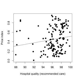
This is the fun part. How does one explain the broad disparity in prices observed in the analysis above? A perhaps naive hypothesis would be that hospitals that provide the highest quality of care are the most expensive. Needless to say, quality of care is not trivial to quantify.  NYS uses recommended care and outcome measures collected by CMS to provide indicators of hospital quality. Outcome measures are rather sparsely available (some hospitals don’t seem to report any) therefore I did not use them. Instead I focused on measures of recommended care, which consists of the care that patients should receive when they arrive at a hospital, the care that should occur during the hospital stay and the instructions that patients should receive when discharged from the hospital. For each hospital, NYS provides measures indicating the percentage of eligible patients that received the treatments or instructions they needed across several categories of care in a given time period. For example, 87/88 (98.9%) patients admitted at Newark-Wayne Community Hospital for heart failure care had their left ventricular function assessed (as recommended). I downloaded all available quality data from the NYS web site (just wrote a simple crawler and HTML parser to do so), then averaged out the indicators. I made sure to only consider hospitals with at least 10 measures of care quality so that the average provides an accurate global measure of quality. Then I asked the simple question: is there a correlation between the hospital price index and quality of care ? As illustrated in the graph below, there is only a weak correlation between these two measures (pearson = 0.15, p=0.05845). The Spearman correlation (based on ranks) is a bit better (spearman=0.24, p=0.003) as it diminishes the influence of the very low quality hospitals on the left part of the plot.

regqual

NYS provides another interesting measure of hospital quality: rates of hospital-acquired infections. NYS provides these data as a tab-delimited file. The dataset includes central line-associated blood stream infections (CLABSI) in intensive care units,  surgical site infections (SSI) following certain procedures such as colon, hip replacement/revision, and coronary artery bypass graft. The dataset also includes Clostridium difficile infections. Here I chose to focus on two global measures of hospital-acquired infection rate: the CLABSI Overall Standardized Infection Ratio and the SSI Overall Standardized Infection Ratio and correlated these measures with hospital price index. The results are clear: there is essentially no correlation between rate of hospital-acquired infection (global CLABSI and SSI measures) and hospital price (pearson = -0.01 and -0.07, p=0.83 and 0.34).

So far we have seen that there is at best a weak correlation between hospital quality and price. How else can we explain disparities in prices ?

I tried several variables:

Whether the hospital is a teaching hospital or not. It’s been suggested that teaching hospitals need to charge more because of their teaching related overhead costs. NYS provides this information on their website for each hospital’s scorecard.

The number of beds. It has also been suggested that the number of beds influences prices as institutions with larger number of beds have higher overhead costs. Likewise this is available on the NYS web site for each hospital (I used the total number of beds).

Volume. Here I just used the total number of discharges per hospital in 2011 in the NYS treatment price dataset. This measure seeks to quantify overall volume. One would hypothesize that the busiest hospitals may be able to offer discounts since they may perform certain procedures very routinely. Alternatively they may have larger overhead costs and need to offset these costs by charging more.

Fraction of discharges that are labelled as complex procedures or diagnosis (APR Severity of Illness Code >= 3). With this variable, I wanted to test the hypothesis that hospitals that often admit patients with complex diagnoses or for complex procedures might need to charge more overall due to higher overhead costs (more staff, specialized equipment, etc).

Price “discount”. This is a reflection of the % difference between the price hospitals charge (treatment charges) and what they actually receive (treatment costs).  The differences are mainly due to insurers not paying the full amount charged by hospitals. Such discounts are often pre-negotiated between hospitals and insurers. I did not want to use % difference because I expected broad discount variability among procedures/diagnoses. Instead I used an index similar to the price index that quantifies how often across all procedures/diagnoses each hospital offers larger or lower discounts. Thus, a discount index near 1.0 means that a hospital offers larger discounts than other hospitals for many procedures.

Average income of local residents. I obtained the zip code of each hospital based on the NYS website, then wrote a couple of scripts in R to interrogate the 2010 Census data and obtain the average income of residents in each ZIP code area. Some of these scripts are based on code found at that page.

What follows is an analysis of each of these variables, one by one. I used linear univariate regression for this analysis. A multiple linear regression analysis will follow – keep in mind that correlated variables in univariate analysis may not be significant in multivariate analysis due to effects of other variables.

Teaching hospitals: I see no correlation at all between hospital price and teaching hospital status (R^2 = 0.01). Teaching hospitals in NYS are not more expensive than non-teaching hospitals at least when using the NYS definition of teaching hospital (one caveat is that it does not distinguish between major teaching hospitals like Cornell and minor teaching hospitals where residents only rotate during their training).

Number of beds: pretty decent positive correlation (R^2 =0.14, p<1e-5). Thus, hospitals with larger number of beds tend to be a bit more expensive.

Overall volume: pretty decent positive correlation there too (R^2 =0.16, p<1e-6). Thus. hospitals that do larger volume and see more patients tend to be a bit more expensive.

% volume of complex procedures: no correlation (R^2=0.002, p=0.6). We will come back to this.

Price discount index: massive positive correlation (R^2=0.66, p<2e-16). Thus, hospitals that have to offer the largest discounts for many procedures are very likely to be more expensive. We will come back to this.

Average income of local residents near hospital: very strong positive correlation (R^2=0.34, p<1e-14). Thus, hospitals situated in wealthier neighborhoods or areas tend to be more expensive.

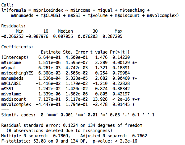
One caveat in interpreting these results properly is that some of these variables are highly correlated. For example, I found that hospital price discount index and local residents’ income are highly correlated (pearson = 0.55). One possible interpretation is that residents of wealthy neighborhoods or areas frequently go to their local hospital and are more likely to have insurance, which in turn overall forces lower reimbursement rates on hospitals. To tease apart these correlations, I turned to multivariate regression. This is the R output of the regression analysis:

linreg

As you can see, the model explains 78% of the variance in hospital price index, which is really not bad. The regression residuals look reasonably normal (not shown).

The multivariate regression analysis really reveals what is happening. First it shows that the discount index is by far the variable that best explains hospital prices. My interpretation is that it is likely that hospitals are increasing their prices when they know that they’ll be reimbursed less given their patient population. What’s surprising to me that is that discounting is more preponderant in hospitals situated in wealthier neighborhoods or areas. As I said, the high percentage of well insured  patients in these areas/neighborhoods may explain the correlation but there might be other explanations that I could not identify. Less surprisingly, income of local residents is correlated with hospital prices even after adjusting for price discounting. Thus it is really true that hospitals situated in wealthier areas or neighborhoods charge more. An explanation is that these hospitals know that local residents are more likely to go to their local hospitals rather than travel to cheaper hospitals in a different area. These hospitals certainly “hit the jackpot” when local uninsured residents pay out of pocket. A hospital’s number of beds is still correlated with how expensive that hospital is, thus validating the hypothesis that  institutions with larger number of beds have higher overhead costs and need to charge more to offset these costs. Curiously, after all the adjustments, it does appear that hospitals that perform a lot of complex procedures or deal with many complex diagnoses are a tiny bit cheaper. It’s not entirely clear what the interpretation should be, but in any case it is a weak factor. Importantly, after taking account all these variables, the previously weak correlation between hospital prices and quality of care is now completely gone. There basically does not seem to be any correlation between hospital prices and quality of care.

Conclusion

This was a first attempt at explaining hospital prices. There are certainly limitations to these analyses as many of them are performed on aggregated treatment prices and variables. Results may differ if procedures/diagnoses were to be considered one at a time. Quality of care especially outcomes are still not well reported and may in the end correlate better with hospital prices. There are many variables I would have liked to consider, e.g. number of medicare/medicaid patients, % of insured patients, etc but I could not easily find this information anywhere. Nonetheless, NYS’ efforts to make hospital prices more transparent by making many hospital datasets available to the public  are a great step forward and should be applauded and further encouraged.


Elemento Lab Highlights of 2013 – What to Look For in 2014 ? December 29, 2013

2013 is coming to an end and was a good year for the lab. We published more than 20 papers and close to 40 more manuscripts are either submitted or about to be. As we are fast approaching a million dollars of grant money per year (direct costs), we must reiterate that we are greatly indebted to the federal agencies, foundations and companies that are investing in us and believe in the vision that systems biology and Big Data will be key to bringing new treatments, new detection and diagnosis methods and perhaps ultimately cures for cancer.

I continue to be proud of our lab members, who have been highly engaged and productive in 2013. Heng presented his work on tumor epigenomic evolution at ASH in New Orleans a few weeks ago and is writing up his manuscript. Katie’s work on computational drug repositioning to inhibit oncogenic transcription factors is about to be submitted. Wei has completed the comprehensive mathematical modeling of a complex signaling pathway often deregulated in cancer (that involved reading no less than 150 papers) and is using her model to identify highly effective drug combinations – combinations that most efficiently shut down the pathway and that make it hard for cells to develop resistance. Experimental testing is under way for the best and worse combinations. Directly related to this, Wei is working on a review for Oncogene where we will describe our vision of why it is critical that we embrace the complexity of cancer and how we can use systems biology to address complex cancer biology problems. Yanwen also presented his work at ASH and we hope his manuscript on DLBCL clonal evolution will soon be accepted for publication. David has been working hard on expanding his computational platform to explore clonal evolution and immune repertoires and in parallel is developing new ways to look for driver mutations in non-coding regions, integrating the many genomewide experiments and WGS datasets (24 tumor-normal pairs, 10 more being seq-ed at NYGC) we have or soon will have available. Ken has been mostly single-handedly building the complex computational analysis platform at the Institute for Precision Medicine that will propel the oncology CLIA exome-seq test we are about to submit to NY state. Mark is working on a new method to dramatically improve detection of chromatin interactions – a kind of dark matter in transcriptional regulation that we think is key to understand how genes are aberrantly regulated in tumors. Matt is setting up a battery of tools and techniques to identify lncRNAs that are driving tumor phenotypes – and how they manage to do so. Last but not least after a productive year and stay in the lab, Jenny is getting ready to move on to her new position as tenure track assistant professor at CUNY.

What’s in store for the lab in 2014? Perhaps more than ever before, we are convinced and will seek to demonstrate that systems biology and Big Data can provide new ways to address unmet needs and complex problems in cancer – problems that are not easily tractable experimentally, such as discovering new ways to inhibit transcription factors or reactivate them, or predicting the most effective drug combinations for each patient given their tumor’s genetic and transcriptional makeup. Regarding transcription factor targeting, we have our eyes on a few key factors, p53 reactivation being one of them. Regarding drug combinations, our 2014 goal is to work with clinicians at Cornell to develop a new revolutionary form of clinical trials where mathematical modeling guides the choice of the combination therapy in a patient-specific manner (think co-clinical trials but with mathematical models where millions of scenarios can be played out in just a few minutes on our supercomputers). The type of tumors we specialize on in the lab, B cell lymphomas, are ideal for this since the pathways can be modeled accurately (that’s what Wei’s work is showing) and there are many very promising targeted inhibitors targeting different components of these pathways that are already in phase I or even more advanced e.g. Ibrutinib.

In 2014, we will continue to think deeply about cancer as a Darwinian process. What that means is that we will think hard about what a cancer Darwinian process implies mechanistically and how that can lead to new and better ways to treat, prevent or at least slow down cancer. We will study selective pressures and cell fitness, how they can be quantified, how they vary in time  and space and how they can be perturbed pharmacologically or via lifestyle alterations. We will continue to study how tumors evolve in vivo (patient samples) and in vitro, seek to identify the mechanistic determinants of tumor evolution, e.g. drug resistance mutations and investigate how we can perhaps slow down or prevent tumor evolution. We will study how tumor cell heterogeneity and diversity – key components of a Darwinian process – contribute to tumor evolution. Heng’s results are showing that epigenomic heterogeneity predicts to some extent which cancer patients will relapse and that it may therefore fuel the relapse phenotype and tumor evolution – an exciting new concept that we will pursue mechanistically. That tumors almost inevitably evolve and overcome treatment reinforces the necessity to develop new ways to better track how and when tumors change in patients; such tracking would preferentially occur non-invasively. Thus, together with other groups, we are experimenting with and will continue to work on ultra low input exome sequencing from fine needle aspirate material (just a few thousand cells) and sequencing from secreted particles e.g. exosomes. We will continue to work on circulating tumor cell detection and quantification to quantify minimal residual disease (and perhaps provide a quicker endpoint for measuring drug efficacy in clinical trials) – the VDJ recombination sequencing technique that we use for clonal evolution analyses indeed provides a natural and exciting way to track circulating tumor cell burden in B cell lymphoma patients.

In 2014, we will continue to look for ways to make cancer mutations more actionable and inhibit targets that are considered undruggable in cancer but unfortunately heavily mutated and driving tumor phenotypes, such as transcription factors. We will investigate how we can use drugs to induce changes in the microenvironment of tumors that make it less favorable to tumor growth (by perturbing the expression of pro- or anti-tumorigenic secreted factors and transmembrane proteins). We will continue to use machine learning to learn how to predict the most effective drug combinations based on information gleaned from single drug studies and a limited number of combinations. We will investigate synthetic lethality within individual tumors and how this can lead to uncovering non-obvious pharmacologically actionable weaknesses in n=1 studies. Continuing on the theme of Big Data, we are excited to tackle the important problem of drug toxicity – can we use Big Data analytics to predict ahead of time molecules or combination of molecules that will induce toxicity and side effects ? new and exciting data suggest this may be possible. We will also investigate the role of immune escape in shaping mutational landscapes in cancer – it’s often forgotten that the immune system is good at recognizing and killing cells that expose non-self mutated peptides. On a related note, in 2014, we hope to pilot microbiome studies in patients undergoing chemotherapy – this is in light of recent papers that show that chemotherapy treated tumor growing mice do not do so well if they also undergo antibiotic treatment that wipes out their microbiome.

We have made significant strides in 2013. I am looking forward in 2014 to making deeper and more exciting contribution to the field of cancer and to finding new and better ways to help detect, diagnose and treat cancer.

We are always looking for talented grad students and postdocs to join the adventure and tackle some of the challenges mentioned in this post (there are many others). If you are interested in joining our group, please feel free to drop me a note.

In 2014, we will continue to look for funds to help us pursue these exciting research projects – we need to recruit more talented people, buy new compute nodes, pay for costly but critical experiments. If you are looking for impactful ways to contribute to what we think is highly innovative and perhaps transformative cancer research and are interested in helping fund some of the projects we work on, please do contact us.


Computational genomics postdoctoral positions at Weill Cornell in NYC November 25, 2012

Filed under: cancer,Cornell,Deep Sequencing,Jobs,sequencing — oelemento @ 2:10 am

Several computational genomics postdoctoral positions are open in our lab to work on a range of exciting cancer systems biology projects.

Potential projects include analyses of tumor evolution and drug resistance, role of lncRNAs in cancer, single cell genomics, personalized and precision cancer medicine, data visualization, regulatory network reconstruction and many more.

Our lab routinely deals with ultra-large datasets (that we generate ourselves or through collaborations), therefore previous experience with Big Data projects is an absolute requirement.

The ideal candidates would have:

– a recent PhD with at least one first-author publication.

– strong knowledge of C/C++ and/or Java programming, with knowledge of a scripting language, e.g. Perl or Python

– excellent knowledge of statistics and experience using R

– desire to work on important biomedical problems

Experience in analysis of deep sequencing data would be a plus.  Experience and knowledge in cancer biology would also be a plus.

Candidates with both experimental and computational expertise are encouraged to apply, as our lab has both dry and wet components.

We are looking for independent, driven and ambitious scientists with strong communication skills.

Duration is 2 years, potentially renewable.

We are looking to fill these positions as soon as possible. A starting date in December 2012 or early in 2013 would be ideal.

Our lab’s website is at http://physiology.med.cornell.edu/faculty/elemento/lab/

Please contact Olivier by email at ole2001@med.cornell.edu with a short description of your background and interests; please include a full CV and phone number of 2-3 references.


A closer look at the first PacBio sequence dataset January 3, 2011

Filed under: Deep Sequencing,pacbio — oelemento @ 6:17 pm

The first Pacific Biosciences (PacBio) sequence dataset was published a couple of weeks ago in the New England Journal of Medicine. PacBio, together with a Harvard group, sequenced 5 strains of Vibrio cholerae including two isolates of the strain responsible for the recent cholera outbreak in Haiti. The NEJM main text mentions their short sequencing run times and long read lengths, but has very little technical details regarding the raw and mapped read data. The supplementary paper contains more information and mainly reveals that single pass sequence accuracy is rather low (~81-83%), and that the sequencing process generates spurious G and C insertions and deletions within reads. So I decided to take a closer look at the data. There’s a lot of hype surrounding their sequencing technology, and I was curious to see what the data is really like.

I am only presenting my re-analysis of their N5 sequence data. N5 is the V. cholerae strain N16961 that was first sequenced in 2000. I downloaded the PacBio raw N5 read data from SRA, at ftp://ftp.ncbi.nlm.nih.gov/sra/Submissions/SRA026/SRA026766/provisional/SRX032454/.

First, some statistics on the raw PacBio N5 data. The N5 dataset consists of 50 runs. Except for one run with an unusually low number of reads (13,673), all runs generated between 47,163 and 48,053 reads. Curiously, about half of the runs had exactly 48053 reads; several others has exactly 47927 reads.

I am not sure how to explain this. One possibility is that the PacBio investigators reused the same SMRT cell multiple times, and that each SMRT cell had a given, fixed number of valid ZMW guides. Interestingly, file names for runs that contained similar numbers of reads contained the names or identifiers, e.g. all ‘00114’ files (m101117_004455_00114_c000025512530000000115022402181120_s1_p0.fastq) had 48053 reads, all ‘adrian’ files (m101119_003042_adrian_c000002772559900000100000112311180_s0_p0.fastq) had 47927 reads , etc. This further supports the possibility that there are several run batches among the 50 runs.

The next thing I looked at was average and maximum read length per run. The average “average read length” across all 50 runs was ~850bp, but it doesn’t tell the whole story: some runs had much higher average read length. In particular, 6 runs had average read length > 2,300bp (impressive), and they had the same label too (‘richard’, i.e. m101114_000451_richard_c000022402550000000115009002041172_s1_p0.fastq). There was no correlation between number of reads and average read length per run.

The maximum read length (bp) per run follows the same trend, with most runs reaching around 5kb, and the 6 runs with high average above showing reads up to 15-25kb.

Altogether, the total amount of sequence generated per run ranged from 6.6Mb to 136.3Mb. The combined amount for the 50 runs was 2.0Gb. Of course, keep in mind that this is the raw, unaligned, unfiltered dataset.

I then combined all runs, and turned to analyzing individual sequences. The PacBio fastq files contain quality scores (c) for each nucleotide in each read. I calculated actual quality scores using p=exp[ (ord(c) – 33) / ( -10 * log(10) ) ], then transformed to p’=1-p, and calculated the average p’ for each read. In this way, the higher the average p’, the better overall read quality. I first looked at the distribution of average quality scores:

The distribution is clearly bimodal, possibly trimodal. What’s interesting is that the bulk of the reads (first large mode) have relatively low quality scores. Filtering out reads with p'<0.25 reduces the total number of reads from 2.3M to 329,575. This is not incompatible but somewhat higher than the number of post-filter reads they report in Supplementary Table 1 (252,726), so they must have used a slightly different way to calculate read accuracy. In any case, using the p'<0.25 filter reduces the total amount of sequence generated by all runs from 2.0Gb to 500Mb. You may wonder why reducing the number of reads by 7-fold only reduces the total number of bases by 4-fold. Here's why: there's a very strong positive correlation between read length and average quality score (p'). Yes the correlation is positive (Spearman rho=0.73), that is, long PacBio reads tend to have higher quality than short reads. The trend is readily apparent when I transform the values to ranks and plot ranks vs ranks (and plot a random sample of 10% of total reads):

So it looks like PacBio generates many, potentially spurious short reads but their long reads might be more reliable. Obviously, using the average quality score is not perfect; it does not capture potential read sub-sequences with higher quality scores.

So far, the analysis I presented did not use the reference genome. The most important question remains how many of the reads can be mapped to the reference genome. To answer that question, I downloaded the reference N16961 genome sequence from NCBI, accession numbers AE003853.1 and AE003852.1 (V. cholerae has two chromosomes, whose combined length is 4,033,464bp).

Because of the large read lengths, low sequence accuracy, short-read aligners like Bowtie and BWA cannot be used to align PacBio reads to a reference genome. Tools often used for analysis of 454 reads, such as BLAT, are also not applicable. As far as I know, the only appropriate tool is BLAST (and the NEJM paper mentions using an alignment methodology that seems very similar to the BLAST algorithm).

The default BLAST (I used v2.2.15) parameters are not appropriate either for sequences showing only ~80% similarity with the reference genome. Here I used match reward = 1, mismatch penalty = -1 (default is -3), gap opening penalty = -1, gap extension penalty = -2. These are the lowest penalty/reward values the program would let me set. The reference genome is short (4Mb), and BLAST run times were usually reasonably short (this will become problematic when aligning PacBio reads to the human genome).

If you are not familiar with BLAST, BLAST will try to find regions of reasonably high sequence similarity between reads and reference genome. It does not try to find a match for the entire read (but will find such matches if they occur) and can make different regions of the same read match to different places in the reference genome. For each match, it calculates an E-value, which the expected number of matches with the same or higher score given read and genome sizes, etc. I used an E-value threshold of 0.01 for this analysis; that is, I want my matches to be relatively unlikely to occur by chance.

For each read, I kept the best scoring match (if it had E<0.01), unless it couldn't be reliably positioned in the V. cholerae genome (multi-mapper). I threw out sub-scoring read matches that were not compatible with the best scoring match (because they match to very different locations in the genome). Compatible read matches were those separated from the best match by a SMRTbell sequence, and read matches whose distance on the read matches the distance in the genome (+/-25%).

Here are what the results look like:
– out of the 2.3M reads, 574,572 (24%) had a significant match (E<0.01) to the V. cholerae genome.
– effective read lengths, i.e. lengths of read regions that matched the genome (after removing gaps) were reduced but still impressive: 403bp on average, median = 356bp, 95th percentile = 973bp, and maximum = 3,016bp. Altogether, the total amount of mappable sequence was ~267Mb or 5.3Mb/run on average.
– excluding insertions, only 79.4% of the aligned nucleotides matched the reference genome. In other words, calculated as I did, the PacBio error rate at the nucleotide level is 20.6%. This number is similar to the number presented in Supplementary Table 1 of the NEJM paper (82.9%). The small difference is probably mostly due to their analysis having been done post-filtering, based on smaller number of high quality reads.
– as reported (but with little details), the PacBio sequencing process introduces a lot of indels. Curiously, I found twice more insertions (50/Kb on average) than deletions within reads (21/Kb).

What about the relationship between the existence of a match to the reference genome and average quality scores ? The plot below shows that the majority of reads with low average quality scores do not contain match to the reference genome.

Using p’>0.24-0.25 as a filter would also maximize the chance of the retained read matching the genome, while minimizing the number of non-matching reads. However this would leave out many reads that still match the genome. Based on these results, and if BLAST run times are not an issue, I would probably not recommend filtering out reads using quality scores at this stage.

Several questions remain, regarding the nature of artificially introduced indels, erroneous base calls, nucleotide bias, whether errors are systematic or random, etc but I hope to have addressed some of the questions that many people (and myself) have been asking about PacBio sequencing.

Given these results, how close is PacBio to sequencing a human genome ? not so close. Assuming 5.3Mb/run of useful sequence, it would take >6,400 runs to obtain a 10X coverage of the genome. Not even counting prep time, assuming a 30 min run time, and 10h-long days, it would take 320 days to get the data (prior to the analysis, which might take longer than the sequencing). While 10X coverage should be enough to detect structural variants (duplications, deletions, translocations, etc), it would probably yield few reliable single nucleotide variants and indels, due to the very high sequencing error rates. No doubts that PacBio is working hard to improve error rates and produce more reads per run (but I personally doubt given these results that PacBio can achieve its stated goal of sequencing a human genome in 15 mins by 2013). In the meantime, PacBio will probably mostly be used to sequence bacterial and viral genomes or to quickly sequence DNA fragments obtained using PCR or targeted DNA capture.


The FIRE-pro paper is out in PLoS ONE January 1, 2011

Filed under: FIRE — oelemento @ 8:50 pm

FIRE-pro is a nice extension of FIRE to find protein motifs from large-scale proteomic datasets. Like FIRE, it is an unbiased, de novo motif discovery tool, which will discover motifs that best explain how proteins or peptides behave in your dataset. We showed in the paper that many of the motifs discovered by FIRE-pro match known motifs, e.g phosphorylation sites, localization and degradation signals.

http://www.plosone.org/article/info%3Adoi%2F10.1371%2Fjournal.pone.0014444


DNA methylation signatures define molecular subtypes of diffuse large B cell lymphoma July 19, 2010

Filed under: Uncategorized — oelemento @ 2:59 am

Together with the Melnick group at WCMC, we’ve just published a new study in the journal Blood in which we mapped DNA methylation genome-wide in >60 diffuse large B cell lymphoma samples and showed for the first time that the DNA methylation of only 15 promoters can accurately predict the two major DLBCL subtypes (ABC and GCB). This is highly relevant because these two subtypes have very distinct survival outcomes, with patients with ABC-type DLBCL having significantly worse prognostic than GCB-type.

http://bloodjournal.hematologylibrary.org/cgi/reprint/blood-2010-05-285320v1


Cancer Bioinformatics Workshop in Cambridge, UK January 12, 2010

Filed under: cancer,seminar — oelemento @ 3:01 pm

One of us (Olivier) will speak at the Cancer Bioinformatics Workshop on Sept 2-4, 2010 in Cambridge, UK. We hope to see you there !

http://www.enm.bris.ac.uk/cig/cb/

http://www.enm.bris.ac.uk/cig/cb/invited.html

Olivier will also give a seminar in the Department of Statistics at the Cornell Ithaca campus, on April 28th. The title will be “Revealing cancer mutations using deep sequencing”.


Revealing Global Regulatory Perturbations across Human Cancers December 10, 2009

Filed under: FIRE,genome — oelemento @ 5:31 pm

This is the title of our latest paper in Molecular Cell:

http://www.cell.com/molecular-cell/fulltext/S1097-2765%2809%2900857-0

With a nice accompanying article by Prensner and Chinnaiyan:

http://www.cell.com/molecular-cell/abstract/S1097-2765%2809%2900860-0

And a story on the Princeton web site:

http://www.princeton.edu/main/news/archive/S26/04/69Q40/index.xml?section=topstories

The paper was highlighted in Nature Reviews Cancer:

http://www.nature.com/nrc/journal/v10/n2/full/nrc2798.html


ASH2009 poster on the EZH2 regulatory program in normal and malignant B cells December 3, 2009

Filed under: genome,Uncategorized — oelemento @ 3:12 am

Two members of the lab (Huimin and Olivier) will be attending the ASH2009 meeting in New Orleans.

Here is the poster we will present at the meeting:

http://physiology.med.cornell.edu/faculty/elemento/lab/files/EZH2_ASH_2009_poster.pdf

And the corresponding abstract on the ASH web site:

http://ash.confex.com/ash/2009/webprogram/Paper25356.html